

Books Redux!
- Michael Jacoby
- May 15
- 4 min read

Updated: May 22

I'm starting afresh in regards to my webcomic books!
The original versions have barely made a profit (and that was mainly from a few non-proof copies I bought for myself and a tiny amount of Kindle Unlimited readers - the latter from early this year!) throughout all the almost half-decade I joined the online publishing venture.
Back in February, I asked on the KDP community forums what could be wrong, with many answers suggesting that it was because of my covers. I admit, with my original covers, they seemed to be unique and noticeable to me when I made them. Ultimately, I made contact with someone who PM'd me about my covers, Inkwell KDP Press, based in Nigeria, who is known for helping out other authors with publishing on KDP.
For months, we talked about how the new covers should look, with me sending mock-ups to him. The new covers seem much more like a major improvement to me. They even influenced some of alterations in the manuscripts, mainly for title pages and page numbers. He also helped me out with updated keyword phrases and fresher synopses for the product pages on Amazon.
Getting back to the covers, I think they're definitely a major step up towards the old versions. They look more like covers for a webcomic (or general comic) collection, like a Garfield collection book, along with similar book covers I witnessed while doing research on Amazon.
I also recently learned that QR codes are now being used to advertise books, i.e. you can place a QR code on a bookmark or a social media ad to link to your book's product page. So, I'm considering using more QR codes for marketing of future books from now on.


The covers actually look nice in their printed form, making their transition from digital to print well. I especially like how the purple bags under the cashier girl's eyes in the middle of the AV cover are noticeable, more so than I thought they would be.
For the pages, I selected premium color white interior, as this setting was promised to make the color illustrations more vivid. And indeed, the setting lives up to its promises.


The die on the varying versions of "The Wound" also appear clearly (as much as they can, anyway).


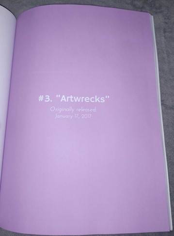
One thing that I was pleased with was how the white text on purple background for AV Vol. 1 turned out in print form. It showed high contrast in digital form, but given that printed media usually darkens colors of digital files, I wasn't too sure how it would turn out.


The text itself didn't turn out that bad. It's still legible and noticeable.
Yes, unfortunately, there are a few errors, most notably (and both I and Amazon managed to miss this), on the title page of AV Vol. 1, as seen above. Not to worry, I'll correct this ASAP! [EDIT 5/22/26: The corrected version of AV Vol. 1, in both paperback and Kindle, is now available for sale on Amazon!]
I also enabled Expanded Distribution for all 3 paperbacks, after hearing it would make KDP books visible to sellers beyond Amazon, like libraries and even Barnes and Noble, although at the cost of lower royalties.
On a semi-related note, here is the pricing for all the books. All Kindle versions cost US$2.99 and are free on Kindle Unlimited. As for the paperback books, while the pricing is a little big, it's unfortunately small enough to be close to Amazon's recommended price.
The Sbuirrels, Vol. 1 costs US$21.35 and its successor, The Sbuirrels, Vol. 2: The Wound Collection, has a price of US$19.35. The cheapest of the three paperbacks is Americus Video, Vol. 1, worth US$15.35. I rounded up each paperback's respective recommended price listing to the nearest nickle (US 5¢; US$0.05), due to pennies now costing more than 1¢ to produce and their subsequent ceasing of production.
This was inspired by retail store pricing, where items were charged to the nearest penny (e.g. $9.99) to force cashiers to open the register to give customers their change, in order to have a proof of a completed purchase. Right now, items are being charged to the nearest nickle because of the US Mint stopping production of pennies.
And as for use of the green color on The Sbuirrels, Vol. 1, I'm not entirely sure if the "Brat" fad created by Charli XCX in '24 was an explicit or subconscious influence (I'm leaning towards the latter). I just needed a background color that would contrast against Ryan and Mary & Ed, along with the logo and the box holding it.
In summary, all three of these updated paperbacks have vivid colors, inside and out. The covers look less like esoteric art designs and more like a standard webcomic/comic book collection that people would actually look at, and the advertising for the books has been, and still is being, improved upon.
So, if you're a fan of strange, off-the-wall humor inspired by the likes of [adult swim], crazy comedy found on the internet, and 1990s/2000s cartoons, buy these published webcomic books now! Just click the links above!


Comments