

The Top 10 DJC Posts from the Last Decade


On this date, 10 years ago, I first published DoorJam Creations (and they said it wouldn’t last…). The fact that I ended up first publishing the site on the 45th anniversary of the opening Disney World in Orlando is only a coincidence. To mark my occasion, I decided to compile the top ten most notable posts/updates on the site.
To find these posts, I took in a few factors. First, it had to be something I enjoyed creating prior to its official publication. Second, it had to be something I enjoy viewing on the site now. Third, for categories of posts like portfolio updates, webcomics, or blog entries, it had to be a specific entry in one of them, not a whole category or series (I couldn’t choose my Logos category of my portfolio and had to pick a specific entry; I couldn’t choose all of Derek the Steam Engine and had to choose a specific story, etc.) And fourth, it had to be something that garnered many views.
Now, here’s the issue with the fourth factor: I’ll admit that my site doesn’t really garner that much views, with one notable exception, and the smallest amount of views received for pages, prior to reaching 1, is 2. So, I really had to scrape the bottom of the figurative barrel here.
Additionally, I ended bending my own self-enforced rules here and cheated a little to have some listings present, and I think the page views and statistics changed between me adding this paragraph and above images to this blog, but it's too late to change the ranking in this article (October is about to start in 9 days).
Finally, before we begin properly, I would like to start off with some honorable mentions, updates and entries that just came close, but not totally, to the 4 above factors or are just too recent to be considered for this list (and will have time to get more popular).
LIKE HERRINGS AND ONIONS #8: “LIFE WITH BONNIE” COVER

This honorable mention is solely for the cover. It was my first ever cover I made for my webcomics, intended to be used for social media advertising, like a pinned Xwitter post. It uses simulated pastel painting and digitized sketches to portray what the issue is about and does its job well. It’s just a shame that the issue (and series) it advertises is cruel, weak, outdated dreck.

In spite of this issue being a blatant rip-off of the Monty Python sketch “Me, Doctor,” I have a soft spot for this specific tale. Being one of the more lighter Like Herrings and Onions stories, it’s a lot more fun to read, especially compared to the rest of the series.
The background wasn’t as fun to draw (as briefly as it totally appears), especially with the repeating lockers, which I made via copying to new layers in Photoshop. This story also doesn’t have a proper ending as I couldn’t think of one. It just stops.

This was just a deliberate example of AI slop, posted on April Fools’ Day 2025, just to have an update for that month. I created the images and blog text using Wix’s AI, which should be most apparent in the former, with their painted appearance.
It got a fair amount of views from people, for some reason.

This got a decent amount of views, but is listed as an honorable mention as it’s only a few months old as of this writing. It was a small story I quickly made, basically a small meandering description that leads to nowhere instead of a proper story (as proper as it could be for The Epiflairy, at least), and it was especially smaller compared to the recent Epiflairy stories. I originally created this one to tie in with the release of The Odyssey.

This also got a fair amount of views and the only reason it’s an honorable mention is that it only came out this January. The main artwork also isn’t that great either, mainly with the lighting.
And now, the official top 10 posts from DoorJam Creations from the past 10 years:

In this one, I’m pretty open about my creative process. Yes, I’m open about it in my graphic design portfolio, but for here, it’s about how I made the creative choices for another thing I produce: YouTube Poops. This blog entry was made in celebration of my 10th anniversary of me joining YouTube Poop under my moniker LordOfTheBoxes12.
While the article is very informative, showing off the reasons for my creative decisions, it does come off as a little self-indulgent at times, mainly me praising my own choices, giving off the vibe of me laughing at my own jokes.

This specific issue of Americus Video got a decent amount of views and, since the new book collection of which it’s apart is becoming fairly popular on Amazon, it seems only right I should include it on this list.
People seem to love the offbeat and strange nature of Americus Video and this issue introduces us to pitchman Willie Days (based upon the late pitchman Billy Mays) selling us Artwrecks, major pieces of art now being used for their wrong purpose.

I open myself up to the public quite more than I usually do in this one, showing how most bad a year I once considered the worst was; the current holder is, unsurprisingly, 2020.
The basic message is to be careful which horrible year you lived through to consider the worst; in fact, I had posted an earlier version of this blog on my personal Facebook page in late 2016, the previous contender for the worst year I lived through.

The title, based on a post-9/11 song, should be “Where I Was When the World Stopped Turning.” I just misremembered the title. I think a major reason for the (admittedly very small) popularity of this blog entry is not just what I say, but how I say it.
The article starts off with various and lengthy quotes about others’ extraordinary experiences on 9/11, ranging from watching their TVs in horror as United 175 crashed into the second tower, trying to leave New York City that day, and, in an immediate bit of foreshadowing, adults who were youngsters during those events.
What follows is a more personal writing than I would normally do, detailing my ironically sparse and selfish recollections of September 11 as a 9-year-old fourth grader living in South Jersey, with my childish concerns being how the events would affect children’s programming on PBS Kids and Nickelodeon. I’m pretty sure my fellow Younger Millennials, aside from those living in/near the affected areas and aspects of course, would feel similar feelings on September 11, 2001.

This is the first of my fudging of my own rules, as I’m technically including two blogs here.
“Adventures in Typography” is probably one of my first ever blogs I put on the site. I added it in early 2019, a little after I decided to start writing blogs for DoorJam Creations. It tells of my personal need to create (typefaces specifically, in this case), how I first got interested in typography during college, and how I learned - through practice, research, and dissection - the secrets of many notable fonts, famous and lesser-known.
I consider its sequel, “More Adventures in Typography,” to be an improvement on the first. Here, I learn more about typefaces, like further specifics about side-bearings and kerning, and the font software I use, FontForge.

Of all of my portfolio pages that garnered a fair amount of traffic, the most viewed (which isn’t saying a lot, but still) had one thing in common: they were all pieces that I had done while working as an intern at Dynagraphix in 2019.
Although the internship was unpaid, I felt like I was moving up in my graphic design career, learning more skills, and becoming more professional. It was at this internship I was taught to have my slides for my portfolio pieces linked visually together and even have parts where a seemingly impossible visual connection is created to make it more interesting to the eyes. You can see that on my portfolio page and my Behance account.
I also learned how to find PSD mockups and create images of how our designs and brand will look, along with creating color schemes for certain projects. For some reason, I don’t recall learning those in college, but I guess that’s what internships are for.

Once again, I’m cheating here, even though I made the rules. All the entries to my series of MPA(A) rating reasons compilations primarily developed since probably my late teens or earlier. In any event, I’ve always had this fascination with the rare verbose, unique MPAA rating descriptors as opposed to the more common ones like “violence and language,” “some sexual content,” “strong violence, some sexuality/nudity, and language,” etc.
I recall looking at the backs of DVDs in stores and occasionally finding the strange MPAA rating reason, such as “strong aberrant sexuality,” “a scene of drug use,” and “graphic crude and sexual humor, strong language and violent images - all involving puppets.” I searched the MPAA site, and keep searching today, for movies with odd rating descriptors and find a treasure trove of them.
The first ever compilation of MPAA rating reasons I ever did was actually in 2011, as test web pages that were saved on a thumb drive and never published online, partially to experiment in and learn more about HTML coding, but mostly to chase my passion of creating lists of strange MPAA rating descriptors.
Later, in 2017, as I was first placing my descriptor collections on DJC, I discovered that the amount of reasons I had on one page seemed a little small, so I added the reasons from the other unpublished HTML pages onto the first few pages to make the collection and page feel more full.

As implied by the title, I made this blog to show off a topic I think readers would find interesting, but also mainly to escape, even for a little bit, from the dreadful, alienating misery that was 2020.
This interest in translating home media from Japan with subtitles and writings in its native language is more recent, even though it initially started in 2010 when the Blu-Ray copy of Toy Story 3 I got for Christmas had Japanese trailers for the film.
It started getting stronger after I saw some YouTube videos of openings and closings to some older Japanese media: the LaserDisc to Brazil and the VHS of The Rugrats Movie.
In this blog, I show my mainly western audience how specifically Japanese home media differs from us and how they’re similar. We also discover what the Japanese language texts and screens translate to in English. As best as we can, anyway.
There are actually two versions of this blog posted, both published on the anniversary of the original recording: December 5. The first one was published in 2019, to commemorate the ending of the 2010s decade. The second one was published in 2025, the 15th anniversary of the recording, and has updated information, screenshots, and videos in stereo, as opposed to the first blog’s unintentional mono audio (though all videos on both articles are transferred visually with RCA wires). Out of both versions, I prefer the 2025 update for its features I just listed.
I thought it was an odd and unique topic, given that VHS recordings of programs and movies on TV seemed to be an impossibility in 2010, even though I later discovered that there are a fair amount of such recordings made even in the 2010s.
As for me personally, these recorded ads showed some things I remembered from the year I turned 18, like Blockbuster throwing a Hail Mary to try to compete with Netflix, and things I had forgotten about, like primitive smartphones.

The many views garnered by this blog post, going past the 1,000 view mark, took me by surprise. It’s my most popular blog entry and the most popular page on DoorJam Creations.
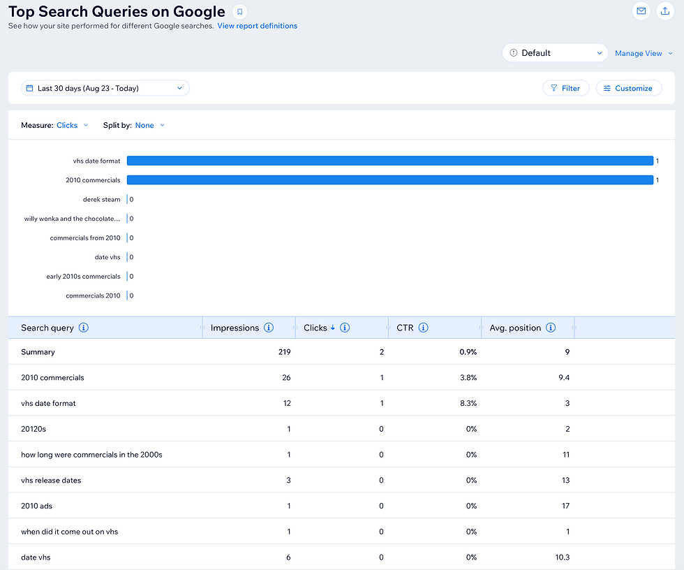
As implied by the title and mentioned in the blog itself, this isn’t meant to be a definitive source on how VHS print dates are produced or what they symbolize. But I guess many people are as hungry for this info as I am. My biggest search terms are for VHS print dates, along with 2010 commercials, so it shouldn’t come as a surprise that this and the previous entry in this list are extremely popular.
To repeat myself from the blog, I’m not 100% sure if all this information is true. Many of the information mentioned here is basically just a bunch of educated guesses. I’m not even sure how other internet users with this knowledge on print dates (like that DLX/037 means that the tape was made by Deluxe on the 37th week of 2000) get their proficiency on this topic.


Comments